Silk Cut: The Ad Campaign That Made Nothing Say Everything
![]()
1983 was a significant year for the United Kingdom. Thatcher was reelected, American cruise missiles were stationed at British bases, and Rowan Atkinson’s Blackadder made its debut on British television. But this isn't a post about the politics and comedy of 1980s Britain, instead we are focusing on one of the most ingenious (and artistic) advertising campaigns that the tobacco industry ever produced, one that said next to nothing and yet communicated everything.
That same year marked the beginning of Silk Cut’s iconic advertising campaign masterminded by Saatchi & Saatchi. What followed was a masterclass in visual metaphor, persuasion, and working within constraints, resulting in a campaign that reshaped the boundaries of what marketing could be.
The Problem: How Do You Advertise What You Can’t Show?
By the early 1980s, cigarette advertising in the UK was tightly regulated. Legislation barred cigarette brands from showing people smoking, using health-related language, or using lifestyle marketing in their ads. Even an indirect suggestion that their products were enjoyable would lead to legal scrutiny.
This left tobacco companies, and their ad agencies, in quite the dilemma. How can they sell a product when you aren’t allowed to show it, talk about it, or even have people associate with it? Most people would consider this as an impossible task that signified the death of many cigarette brands. Saatchi & Saatchi, however, saw it as a challenge.
Instead of fighting the restrictions, they leaned into them
The Breakthrough
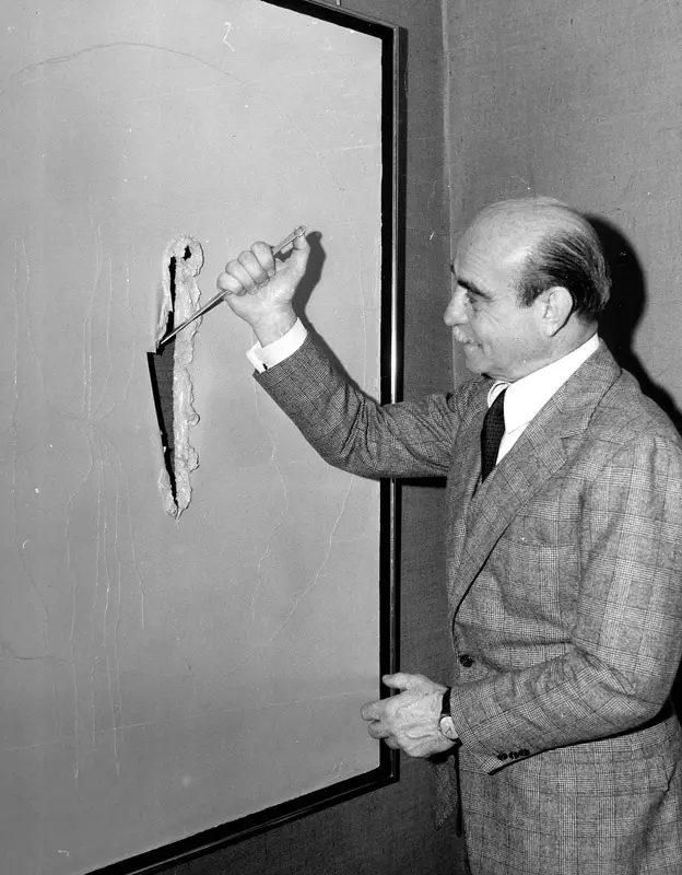
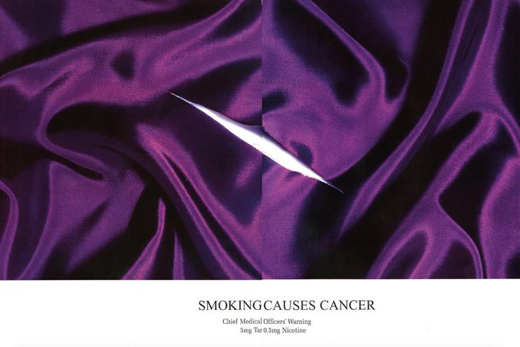
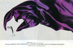
Charles Saatchi of the Saatchi & Saatchi advertising agency drew inspiration for the ad campaign from Italian artist Lucio Fontana’s works revolving around slashed canvases. Playing off of this, the first Silk Cut poster showed a rich swath of purple silk, sliced cleanly with a razor. There was no slogan, no logo, no product shot; just texture and color.

The message was unmistakable. Silk. Cut. The name of the brand wasn't shown, but implied, activating the viewer’s mind as part of the message making process. What could have been an exercise in constraint turned into a powerful lesson in visual literacy. The audience was trusted to understand, and in doing so, became complicit in the elegance of the campaign.
Selling Ideas, Not Product
The brilliance of Silk Cut’s campaign was how abstract it was. Without the ability to showcase cigarettes, the brand shifted focus to symbolism. The smoothness of the silk hinted at a refined experience. The sharpness of the cut nodded to boldness, and edge. And the purple, a striking color that stands out as regal and provocative
Instead of pushing a product, the campaign invited viewers to play a sort of game. It sold association. You didn't just see an ad, you solved it. The satisfaction of decoding reinforced brand engagement. It made the audience feel clever for recognizing the brand at all.
From Minimalism to Surrealism
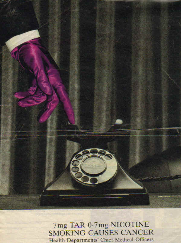
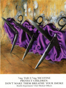
What followed was a remarkable evolution in visual storytelling. Saatchi & Saatchi created a series of posters and print ads that riffed endlessly on the core metaphor. A shark’s fin slicing through purple cloth. Scissors endorned in purple dress, reminiscent of cancan dancers. A purple shower curtain in reference to Hitchcock’s Psycho.
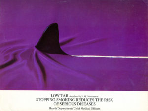
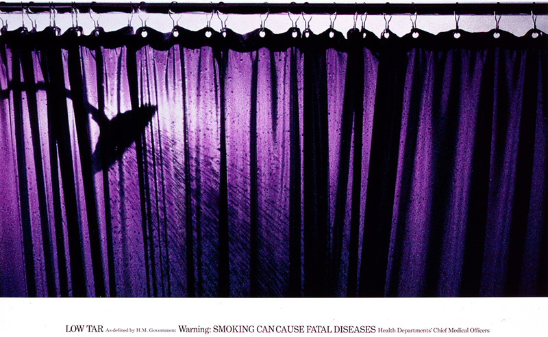
Each advert played with visual language while preserving the core symbols: silk, and something that cuts. The metaphorical game continued, never repeating itself yet staying thematically consistent. The campaign’s longevity, spanning well over a decade, was due in large part to this creative elasticity.
High Art and Consumerism
Silk Cut’s campaign occupies a liminal space between advertising and contemporary art. It rejected the obvious. It made viewers look twice, and functioned as much on implication as communication. They pointed at that which they weren’t allowed to show. It was advertising that respected the intelligence of their audience and let them arrive at a conclusion themselves, much like the way an artist views their work.
Cultural and Creative Legacy
By the time the Uk banned tobacco advertising altogether in the early 2000s, Silk Cut had already cemented their place in advertising history. Its posters now appear in textbooks, museum exhibits, design retrospectives, and blog posts much like this one.
More importantly, the campaign redefined what it meant to advertise under constraint. In turned censorship into creativity, demonstrating that when forced to communicate without the crutchers of product placement or celebrity endorsement, brands can turn to metaphor, mood, and narrative suggestion.
Web3’s Silk Cut Moment: Lessons for ApeChain NFTs
Silk Cut’s campaign didn’t sell cigarettes, it sold a feeling. It mastered the art of saying everything by showing almost nothing, letting symbolism and mystery do the heavy lifting. That’s exactly the kind of approach Web3 projects, especially on ApeChain, should learn from.
In a space crowded with loud promises and floor talk, subtlety stands out. Just like Saatchi & Saatchi leaned into constraints, Web3 brands can thrive by embracing them: crafting narratives, teasing ideas, and letting the community “get it” on their own. People don’t want to be sold to, they want to feel smart, part of something clever, part of something theirs.
Silk Cut built a world without ever showing the product. Great NFTs do the same.